BOB BOB
Identidade Visual
BOB BOB - Visual Identity
A BOB BOB é uma loja de brinquedos que acredita que brincar é para todos - independentemente da idade.
Este projeto autoral transforma o ato de brincar em algo atemporal; a BOB BOB oferece diversão para crianças, adolescentes e adultos que não perderam o gosto por se divertir. Sua missão é inspirar uma educação mais livre e saudável, sem estereótipos ou limitações de gênero — porque brincar é um direito universal, cheio de descobertas e alegria.
This self-initiated project transforms play into something timeless; BOB BOB offers fun for children, teens, and adults who haven’t lost their love for play. Its mission is to inspire a freer and healthier form of education, without stereotypes or gender limitations — because playing is a universal right, full of discovery and joy.
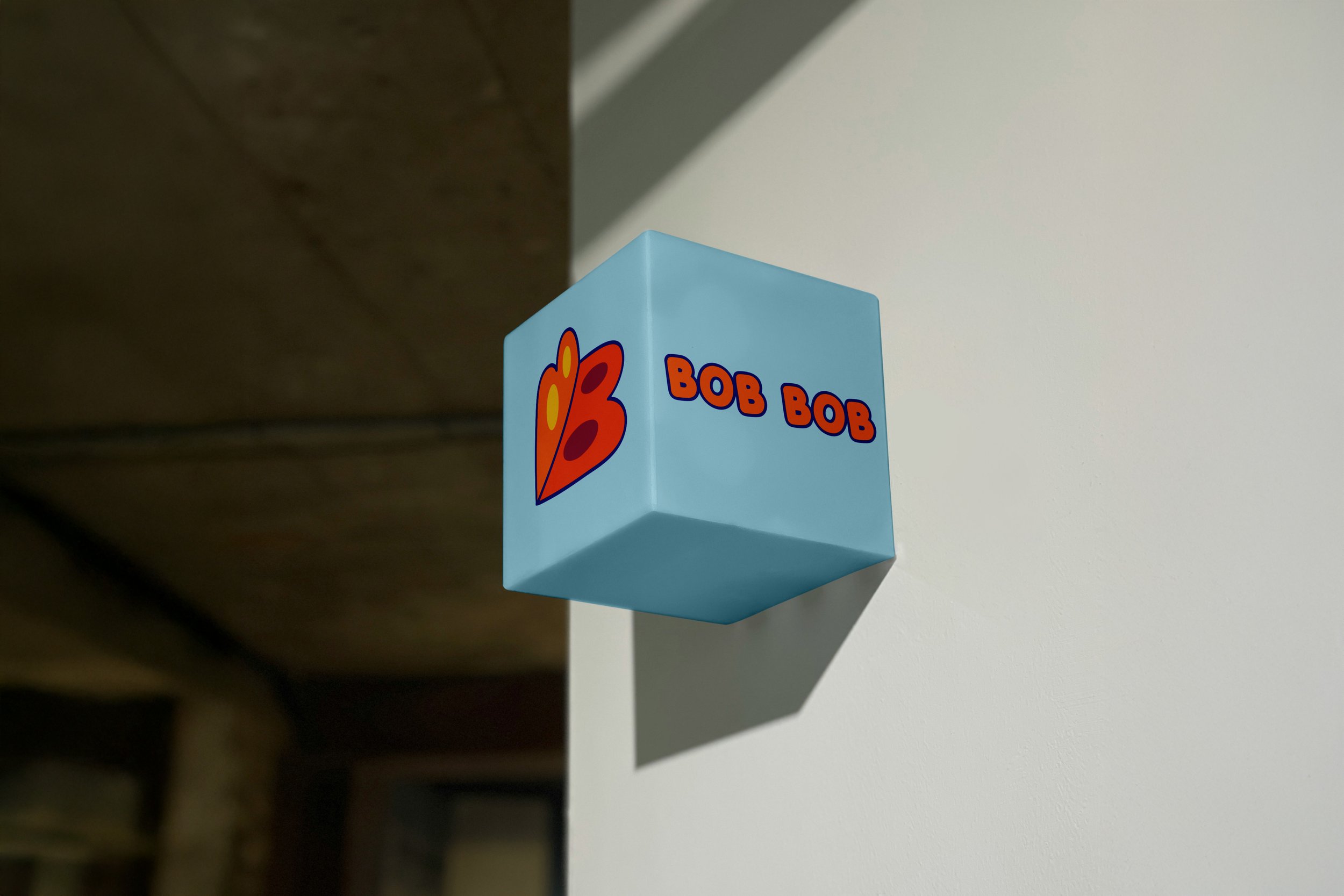
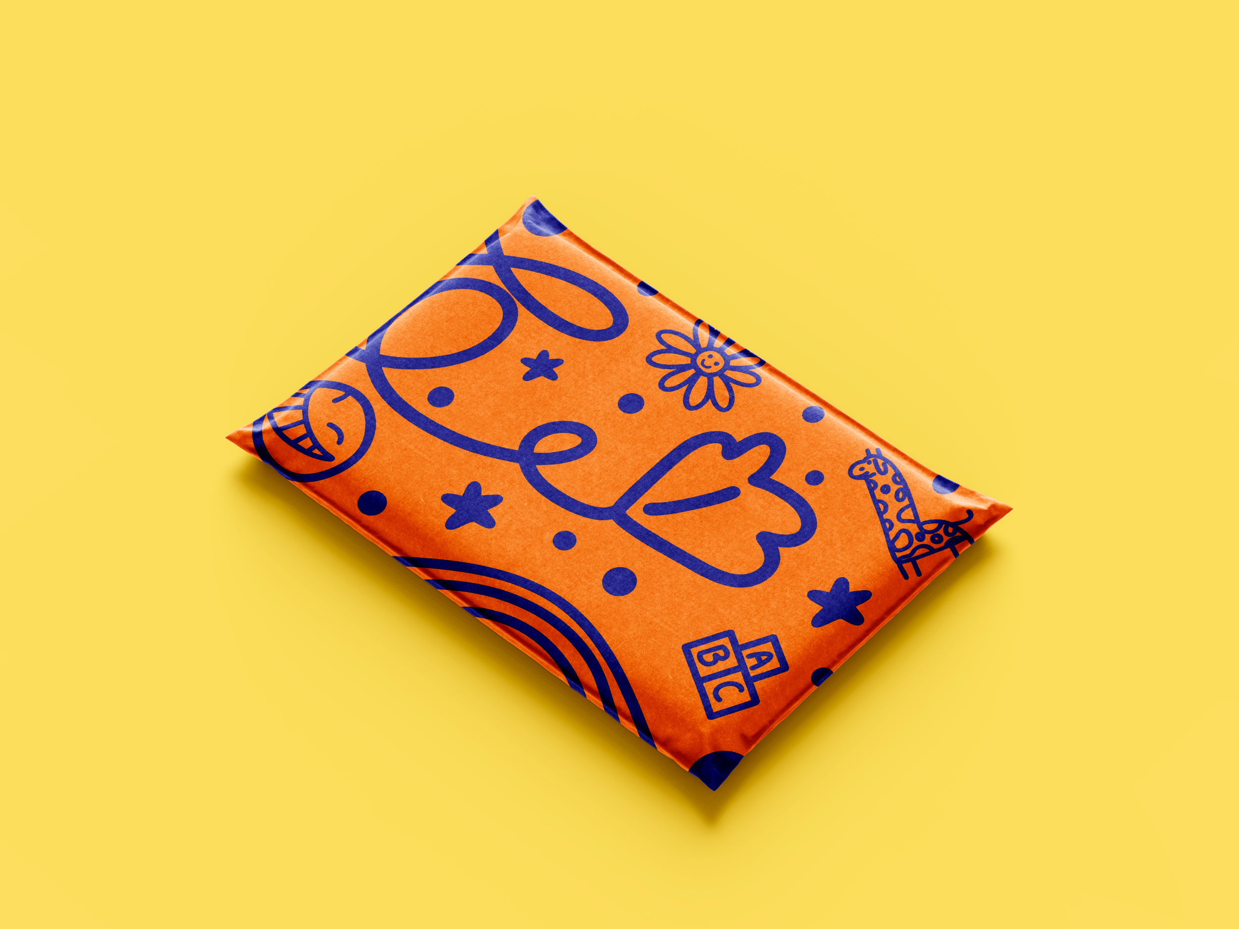
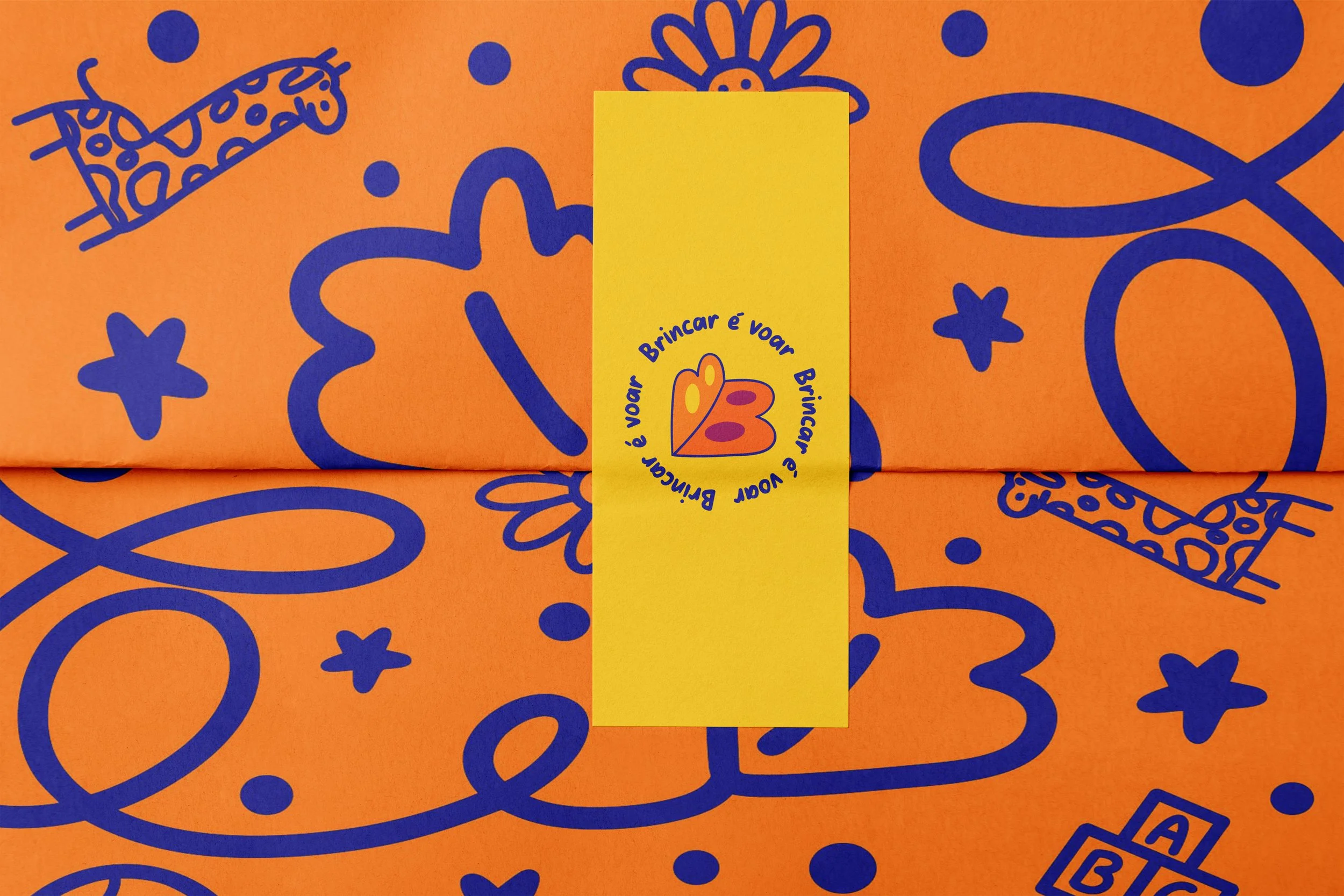
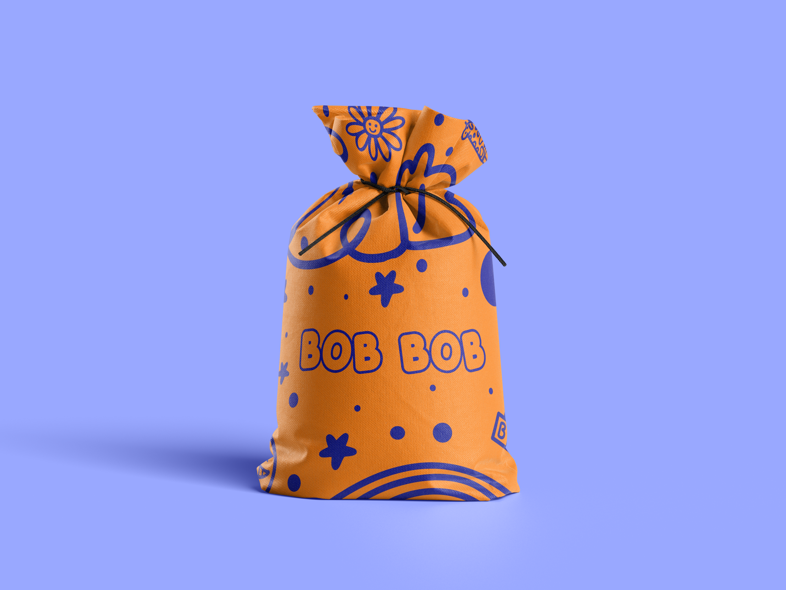
O símbolo da marca nasceu da união dos dois “B” de BOB BOB, que juntos formam uma borboleta — representação perfeita da imaginação, liberdade e leveza do brincar. A forma divertida e colorida traduz o espírito alegre e criativo que a marca deseja despertar em cada criança.
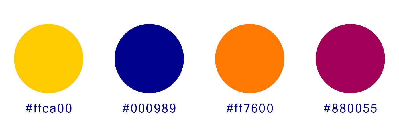
O logotipo combina o símbolo e a tipografia da marca, criando uma identidade visual divertida e acolhedora. As formas arredondadas e o uso de cores vibrantes reforçam o caráter infantil, transmitindo alegria, criatividade e espontaneidade.
The brand symbol was created by combining the two “B”s in BOB BOB, forming a butterfly — a perfect representation of imagination, freedom, and the lightness of play. The playful and colorful shape reflects the joyful and creative spirit the brand wishes to inspire in every child.
The logo combines the symbol and typography to create a friendly and cheerful visual identity. Rounded shapes and vibrant colors reinforce its childlike character, conveying joy, creativity, and spontaneity.
Para a tipografia, as fontes PORKY’S e BABY-CRIBS foram escolhidas por transmitirem um ar leve e divertido, além de suas formas brincalhonas e alegres refletirem a essência da marca.
For typography, the PORKY’S is the font for the brand name, and BABY-CRIBS is the font for the slogan “Brincar é voar” (Play makes you fly), which were chosen for their lighthearted and fun appearance, as their playful forms reflect the essence of the brand.